 I used the circle tool to devise another puff. It is green with a white boarder to follow my house style. It mentions the final trailer of 'Star Wars VIII' which I predicted would be released at the time of this issue as it is coming out in December. I used exclamation marks to make it appear exciting.
Monday, 24 April 2017
Creating My Cover Page-Part 8 (Circle Puff)
I used the circle tool to devise another puff. It is green with a white boarder to follow my house style. It mentions the final trailer of 'Star Wars VIII' which I predicted would be released at the time of this issue as it is coming out in December. I used exclamation marks to make it appear exciting.
Creating My Cover Page-Part 7 (Text at the Bottom)
 At the bottom of my cover page, I placed another banner. It uses 'Empire's' conventional, italic 'Plus' and also makes reference to more films that are being released at the end of 2017 including 'Kingsman' and 'Insidious'. It talks of an interview and a review which are commonly found in magazines. It still follows my green, white colour scheme to maintain the house style.
Creating My Cover Page-Part 6 (Text at Top)
 At the top of my cover page is a banner that
informs a reader of the contents within the magazine. It references a countdown
of 'The 50 greatest horror movie moments' and mentions many famous horror films
like 'Alien' 'Scream' and 'Friday the 13th'. This was inspired by the
'Independence Day Resurgence' cover of 'Empire' magazine where its cover
mentions a countdown of the 'The 50 greatest sci-fi moments'. I adapted this to
'horror movie moments' to suit the genre of my film and the October/Halloween
release date of the issue.
At the top of my cover page is a banner that
informs a reader of the contents within the magazine. It references a countdown
of 'The 50 greatest horror movie moments' and mentions many famous horror films
like 'Alien' 'Scream' and 'Friday the 13th'. This was inspired by the
'Independence Day Resurgence' cover of 'Empire' magazine where its cover
mentions a countdown of the 'The 50 greatest sci-fi moments'. I adapted this to
'horror movie moments' to suit the genre of my film and the October/Halloween
release date of the issue.
Creating My Cover Page-Part 5 (Barcode and Puff)
 Almost every magazine has a barcode on its cover as it is necessary for retail purposes so I placed a barcode onto my cover page. Underneath the barcode is a puff that informs of the magazine's contents. From my research, I discovered that Thor: Rangnorok is set for release in November and therefore assumed that a trailer would be released in October. I made reference to this in the puff where the subtitle is 'Thor Preview'. It is also due to be the final Marvel product of 2017 and I made reference to this in the text below my subtitle. I also found that 'Jumanji' is being released at the end of 2017 and therefore included this in the puff too. The subtitles in green text due to their importance with further provided information being in white. This follows my colour scheme of green and white.
Creating My Cover Page-Part 4 (Film Title)
 Over the main image, I placed the title of my film. This is the largest font on the page as the magazine's focus is upon 'Coulrophobia'. Below it is a phrase that compliments the title which reads 'The most suspenseful film of the year!'. It is underlined to increase its importance and the exclamation mark constructs a sense of excitement. These subtitles are common among 'Empire' cover pages as they provide further information towards the film they are about. The word 'most' is a buzz word that derives a reader's attention. All of this text is in the colour green as green and white is the house style I've decided upon. Green is commonly used to represent horror and evil.
Creating My Cover Page-Part 3 (Taking Pictures and Adding to Photoshop)
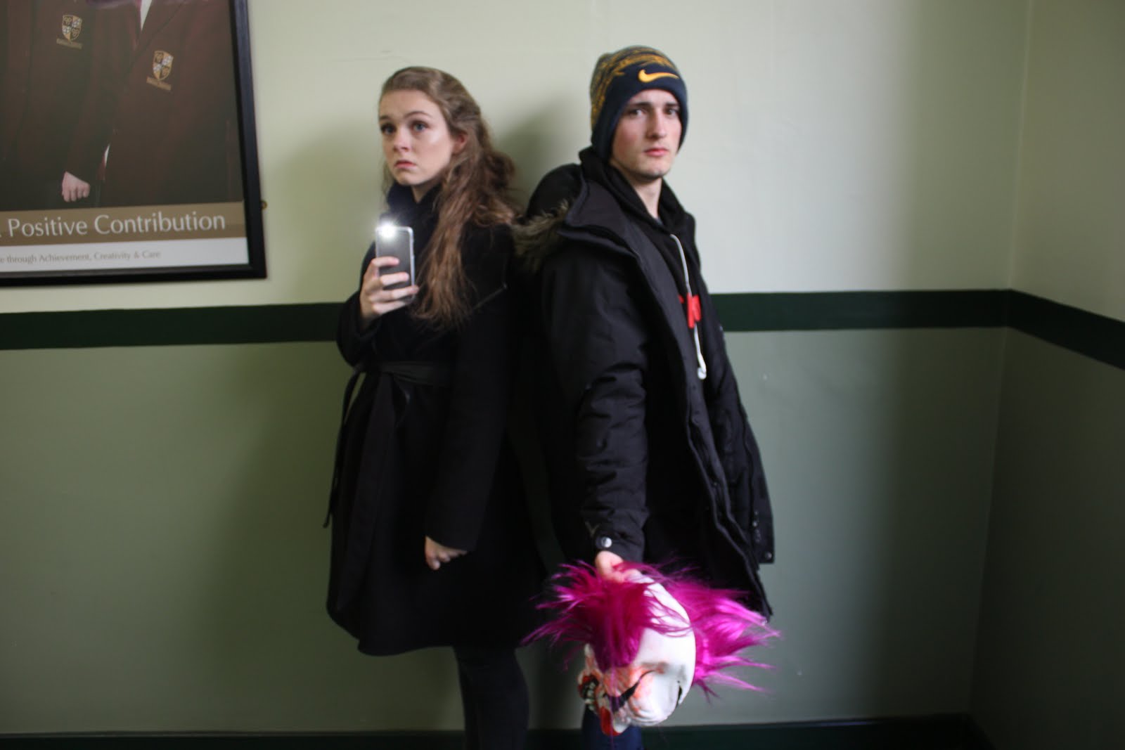

For my magazine's cover page, I required a medium close up shot of my actors. For convenience, I took this shot in school. Despite the indoor location, there was a large window behind my and therefore, natural sunlight shone on my actors. I experimented with two possible shots. One consisted of my actors stood back to back whilst fearfully looking at the camera. I directed Lydia to her phone with its torch light lit whilst Danny held the clown mask. However, due to the bright lighting, the torch did not work effectively. Another shot I directed echoes an aspect of my trailer where the two are backing away from the camera whilst Danny is in the forefront, protectively outstretching his arm. He holds the clown mask to allude to the villain despite its lack of appearance. I used the eraser tool to remove the background. I also found that Danny was wearing earphones in the shot but this problem was simply solved through the use of the of the spot removal tool to realistically remove the earphones. I made the image of my actors protrude over the 'Empire' logo as this is a convention of 'Empire' magazines.

Creating My Cover Page-Part 2 (Empire Logo)
 Next, I implemented an image of 'Empire's' logo. This was initially red in colour and therefore clashed against my background. So, I used the fill tool on photoshop to make the logo a bight white colour which was much more clear than the original red logo. I used the text tool to add the issue date (October 2017), website address ('empireonline.com') and the price ('£4.50, $9.99') and placed this between the points of the letter 'M'. A convention of 'Empire' magazine is to place this information within the letter 'M' and therefore, I replicated this for my own cover page.
Creating My Cover Page-Part 1 (Background)

For the background of my cover page, I decided to use the same image used for the background of my trailer's title and release date. This creates an increased connection between the two products. However, this image is in a landscape format and I required a portrait background.To solve this problem, I added identical images of this burnt circus tent to a photoshop page and closely matched them together.To make these look like a single image, rather than 8 images placed together, I used photoshop's spot removal tool. This made the red lines appear as that were more connected and removed some of the burnt outline and made the burns more inconsistent instead of neat and linear lines.


Friday, 21 April 2017
Creating My Poster-Part 8 (Logos and Credits)
 I pasted the logos for both 'Warner Bro's' and my own logo for 'TigerGuard Productions'. This creates consistency by relating to my film further. I used SF Movie Font to write credits at the bottom of the page. It references my actors and websites used. The white text helps it stand out against the black background and the font size is quite small as a lot of information is required in this section.
Creating My Poster-Part 7 (2D, 3D and IMAX 3D)
 I added text at the bottom of my page which indicates that my film is watchable in '2D, 3D and IMAX 3D'. I copied and pasted the logos for both '3D ' IMAX 3D' . This modernises my film and gives variety to an audience with flexibility on how they'd watch a film.
Creating My Poster-Part 6 (Release Date)
 I added a release date (which is the same as the one on my trailer-October 29th) at the bottom of my poster. I used the same glowing font used for my title to create constancy and because the release date is just as important as the title.
Creating My Poster-Part 5 (Ambiguous Text)
 |
| At the top of my poster, I used the text tool to add a phrase at the top of the poster in white text. This contrasts against the black background and makes it stand out. These are used on horror movie posters as they intrigue an audience. My use of a rhetorical question creates further intrigue. |
Creating My Poster-Part 4 (Title)
 |
| I added my title to the bottom of my poster. This is the same logo that is used in my films trailer so and is the main thing that connects my poster to my trailer. The blue glow makes it brightly stand out against the black background. |
Creating My Poster-Part 3 (Background)
 |
| I used the fill tool to make the background black. This complimented the shadowed part of my image and helped hide the mask further. The darkness furthered the scary atmosphere created by the poster. |
Creating My Poster-Part 2 (Editing the Picture of My Clown Mask)

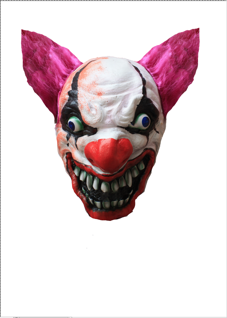 |
| I used the eraser tool to remove the background of my image. I used this tool combined with the healing tool to make the hair on the right side appear more neat and pointy. I then erased the hair on the left side, followed by selecting the hair on the right side and copying, pasting and flipping it and replacing the left hair with this new image. Therefore, symmetry was created. |
 |
| I added a shadow over the bottom of my image. This created an ominous atmosphere and made the mask seem more unsettling as it is partially hidden. |
 |
| I attempted to remove the orange aspect of the image with the spot removal tool but this proved to be difficult and I was unsuccessful. I solved this by selecting half of the image and then copying, pasting and flipping it on the other side to hide the orange and create more symmetry. |
Creating My Poster-Part 1 (Taking shots of the clown mask)
 |
 |
 |
 |
Thursday, 20 April 2017
Using iMovie-Part 7 (Placing Images and Backgrounds)
 |
| After showing the big institution logo, the logo for my fake institution appears. This is because a convention within trailers is showing several studio logos at the beginning. I created this in Photoshop and it is reminiscent of the MGM logo which is of a lion in a circular ribbon roaring |
 |
| Before any content is seen, the text 'This Halloween' is seen. It has a red font as red is symbolic of blood and danger. It is against a background of space. This background is one of iMovie's own images that can be found in the 'Maps, Backgrounds and Animatics' section. The darkness and emptiness of space helps create an eerie tone. The sky littered with stars is reminiscent of nighttime which makes for the setting of a large part of my trailer. |
 |
| When my trailer ends, the logo for 'Coulrophobia' is seen. This is at the end of the trailer as the title would remain in an audiences mind. I created this in photoshop by using the logo from my magazine cover and placing it against a background of a burnt circus tent. This circus tent is the background of my magazine cover. |
 |
| My trailer ends with the release date in a stylised and bold italic font. It is against the same background of a burnt circus tent as my title was. This is the final thing seen in the trailer to ensure that the date of release also remains in the mind of the audience members. |
Using iMovie- Part 6 (Adding institution logo and rating)

A convention of trailers is having an age rating and institution logo at the beginning. For my trailer, I imported the trailer for 'Harry Potter and the Deathly Hallows' so I could use iMovie to crop the first 10 seconds of the trailer (Its age rating and studio logo) and implement it onto my film. I used this particular trailer's opening as it suited my trailer effectively. The age restriction of PG-13 accompanied by text warning parents of 'intense action and frightening images' echoed my trailers content as it includes both of these. I chose to not begin my trailer with a red band as; sex, drugs, bad language or blood are not included in my trailer.
Using iMovie Part 5 (Adding Music)
For the background music for my trailer, I wanted a spine-chilling
score. I used the royalty-free website ‘Orange Free Sounds’ where I listened to
many pieces of music. I eventually decided upon one entitled ‘Creepy Doll Music’,
which is an ever suspenseful, and piercing sound. Its noise is reminiscent of a child's music box. This echoed the plot of my film in that, like clowns, dolls and music boxes are conventionally innocent icons of childhood which (in this case) have been subverted and antagonised into something scary. After downloading this music, I was able to simply drag it into I movie where it moulded over each shot within my trailer. I was able to crop the length and adjust the volume of this to suit what I required. 
Using iMovie-Part 4 (Adjusting Shots)
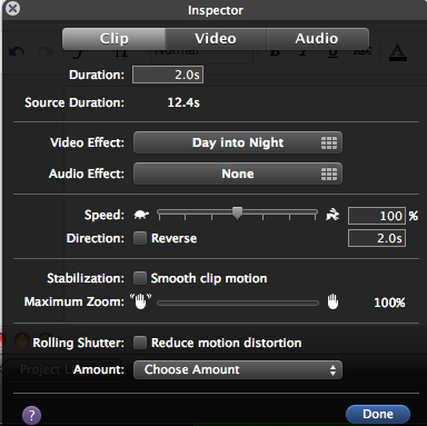
 iMovie gave me the ability to adapt my shots to suit my needs. By opening a 'Video Inspector', I am capable of applying qualities to each individual shot. It allows for the duration of shots to be changed through text alongside its feature of manually cropping. I found the 'Video Effect' feature to be particularly useful. It gave me the option to place a filter over my shots. Because my actors were only available between the hours of 1pm-3pm, I was incapable of filming at night. It would also be unsafe for me to film at night. Therefore, for shots of which I wanted to take place at night, iMovie gave me the ability to use the 'Day into Night' filter. This made the shots appear like they were filmed in the nighttime despite being made in the middle of the day. 'Video Inspector' also gave me the ability to change the speed of each shot. This could be done manually by siding a bar closer to a turtle symbol or a hare symbol for slowness and speed respectively. It can also be done through inputing a percentage of speed with 100% being normality. I used the faster speed to make chase scenes appear more intense. Stabilisation allowed for me to smooth any motion within a clip. This was helpful as my shots were filmed with a handheld camera and this tool steadied my clips. I used the audio tab to mute the majority of my shots by sliding the volume bar to 0%. I did this as the main sound used within my trailer was the background music.
Using iMovie-Part 3 (Transitions)


 Throughout my trailer, I used fade to black transitions.
These are conventional of horror movie trailers with an example being the Insidious trailer 1(https://www.youtube.com/watch?v=fBbi4NeebAk). These transitions maintain the eerie atmosphere as the trailer is constantly returned to darkness. The subtlety of the transition compliments the suspenseful tone of my trailer. At the climax of my trailer, I used no transitions to create jump-cuts. This made for a fast placed compilation of shots which is a convention of horror trailers. iMovie gives an vast array of potential transitions that are easily implemented into a creation by dragging the transition one desires and placing it in between shots giving an effective bridge between segments.
Using iMovie-Part 2 (Importing and Cropping Shots)
I imported my all of my shots into iMovie. These are now all
in a single, easily accessible place and I am now capable of freely placing the
shots into my film. I am also able to crop my shots to ensure that any unnecessary
aspects of a shot are left out of my trailer. By dragging a yellow box, I am
able to select the part of a shot that I desire with the first yellow line
representing the start of the shot and the second representing the end. It can
be made wider and shorter if needed.


Using iMovie-Part 1 (Placeholders)

Before I began shooting, I made use of iMovie in order to construct a storyboard. I did this by using the silhouette placeholder feature on the application. This allowed me to estimate the timing of my trailer and also helped me visualise what my finished product would look like. The images helped represent each shot that I wanted as there was a variety of shot types for the silhouettes such as closeup, medium close up, two shot and landscape shot. As I progress with my trailer's construction, I will replace these placeholders with real shots whilst maintaining my trailer's overarching framework.
Tuesday, 18 April 2017
Creating my film's logo
I discovered a website called 1001 fonts. Through this, I was able to access many font types. I found a particularly creepy font and decided to screenshot it for use in my film.
 I then opened a new Photoshop C5 page and placed it within. I initially gave it a pattern overlay called 'Blue Crepe' as I believed a dark blue colour would be reminiscent of a dark night sky.

 After this, I added a gradient overlay and a colour overlay with a purple-blue colour to make my logo appear darker.
 Then, I added green coloured inner and outer glows. This allowed for my font to stand out against any background it was placed upon. The brightness of the glow and the contrast in colours gives a supernatural feel.
 An inner and drop shadow complimented the creepy tone of my title making it appear even darker despite being easily visible. The shadows also gave another dimension to my logo making it stand out further.
 The Bevel and Emboss allowed me to adapt a contour and grayscale stone pattern to my film's title. I set its shadow mode to a bright blue colour which gave a vibrant outline to my title.
I completed my title by giving a Satin contour and by adding a Blue Dust pattern for the stroke of the title.

 I then opened a new Photoshop C5 page and placed it within. I initially gave it a pattern overlay called 'Blue Crepe' as I believed a dark blue colour would be reminiscent of a dark night sky.
 After this, I added a gradient overlay and a colour overlay with a purple-blue colour to make my logo appear darker.
 Then, I added green coloured inner and outer glows. This allowed for my font to stand out against any background it was placed upon. The brightness of the glow and the contrast in colours gives a supernatural feel.
 An inner and drop shadow complimented the creepy tone of my title making it appear even darker despite being easily visible. The shadows also gave another dimension to my logo making it stand out further.
 The Bevel and Emboss allowed me to adapt a contour and grayscale stone pattern to my film's title. I set its shadow mode to a bright blue colour which gave a vibrant outline to my title.
I completed my title by giving a Satin contour and by adding a Blue Dust pattern for the stroke of the title.

Subscribe to:
Comments (Atom)