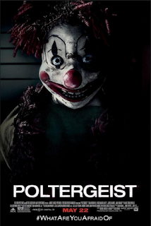
 I decided to take inspiration from the poster for 'Poltergeist' for my own poster. It consisted of a clown facing the camera with a shadow taking half of its face. The title is at the bottom of the page to ensure that the clown gains the majority of an audience's attention. Below this, credits, studio logos and a release date lies.
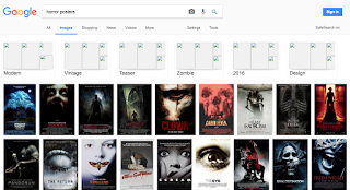
 After a using a Google image search of 'Horror Posters', I discovered that it was conventional for posters to simply include a face of either the antagonist or their victim. I will take this into consideration when constructing my poster. Another convention I found was the placement of an ominous phrase to intrigue an audience. This is usually at the top of the page. I will place a sinister phrase at the top of my poster in a similar respect.
No comments:
Post a Comment